
Home
This project is done in Proscom for High School of Economics
👩🏼💻 My role
Lead Product Designer — research, prototyping, leadership, contributing to design, interaction with stakeholders, mentorship, defining processes, creating vision and strategy.
👨🏾💻👩💻 Team
3 Product Designers
1 Product Managers
1 UX-Reseachers
3+ Developers
📈 Outcome
8% increase in user engagement
30% rise in course resumption rate
12% reduction in process time
16% improvement in student NPS score
📜 Background
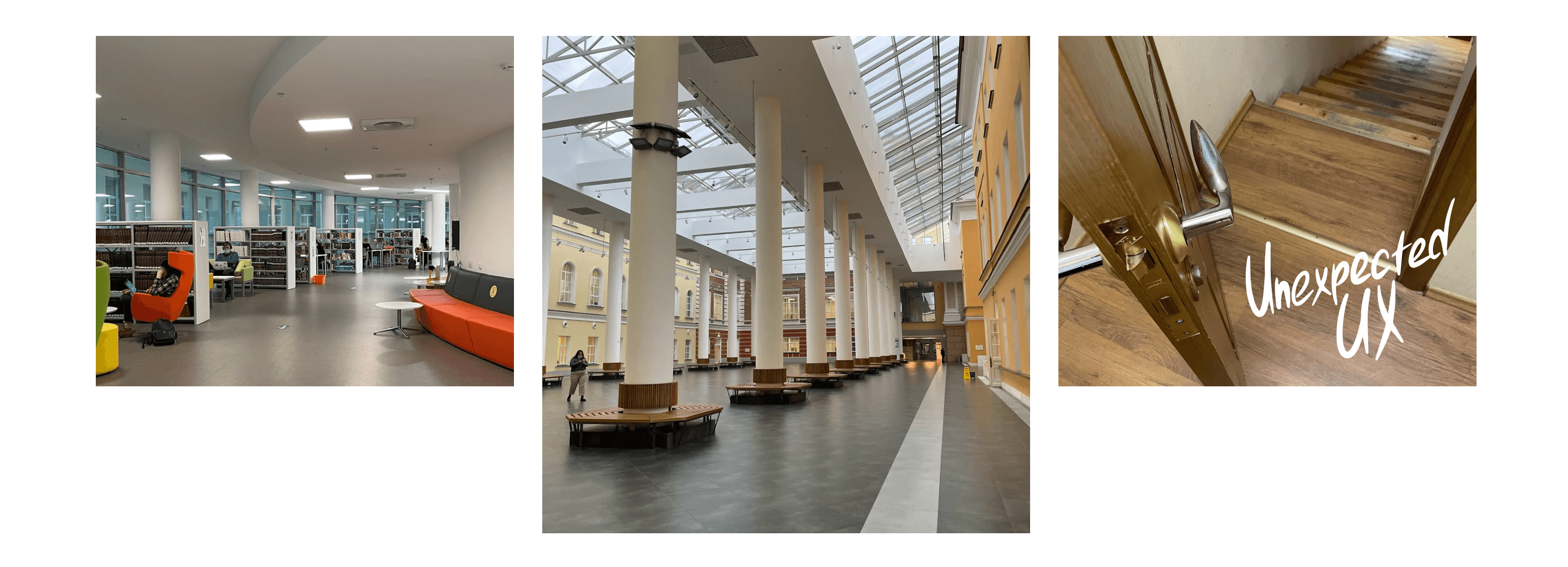
High School of Economics — one of the leading and most renowned universities in Russia, founded in 1992. Before this project, changes were made to the information architecture of the HSE LMS project, which led to the need to synchronize the user experience and information with the mobile application.
💭 Summary
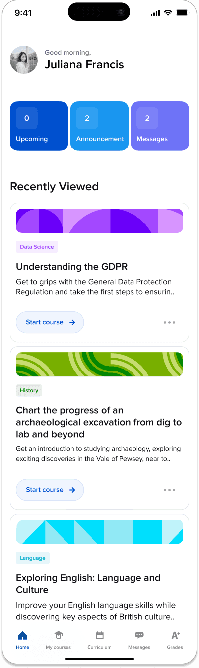
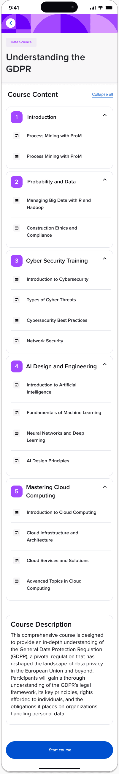
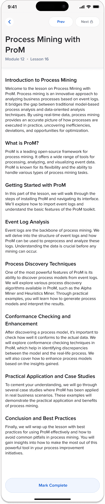
In this project, I adapted a desktop-based Learning Management System (LMS) for mobile App use, focusing on enhancing the user experience for High School of Economics students. I re-evaluated the initial desktop research, prioritizing mobile usability. Using the Google HEART framework, I addressed challenges related to screen size, navigation, and content adaptation. The final design, refined based on user feedback, significantly improved the mobile LMS experience.
Problem definition
The project aimed to synchronize data from the desktop version to the mobile and enhance accessibility, engagement, and overall user satisfaction with the LMS on mobile devices.
The project involved adapting the Information Architecture (IA) of an existing desktop-based Learning Management System (LMS) for a mobile application. The primary goal was to create a mobile-friendly version of the LMS that maintains the core functionality and user experience of the desktop version, while leveraging the unique capabilities and usage patterns of mobile devices. This adaptation was essential to meet the evolving needs of users who increasingly rely on mobile devices for educational purposes, ensuring they have seamless access to learning resources and tools regardless of the platform.
Although the research stage was already done for a desktop version I've conducted a re-evaluation of the initial desktop research through the lens of mobile usability. Me and UX-researcher focused on understanding how user interactions, needs, and behaviors change when accessing the LMS via a mobile device. This included analyzing data on mobile usage patterns, screen size limitations, touch interface interactions, and mobile-specific user expectations. Additionally, we revisited user personas and scenarios to ensure they were still relevant and reflective of mobile users' needs.
Thanks to the renewed research phase, we focused on students' experience using mobile apps during their studies. As a result, we discovered specific data that significantly changed the initial problem setting:
❗ More than 60% do not have or do not carry a laptop with them to the university
❗ More than 80% use email and social networks to communicate with teachers and classmates
In light of such data, I organized a meeting with stakeholders and proposed to focus future development efforts on the mobile application for the LMS. A supporting factor was also that the mobile application is made by React framework, which removes technical limitations set by Moodle.
In order to provide a structured approach to evaluating and enhancing the user experience, ensuring the mobile design meets both user needs and business objectives I've used the Google HEART framework.

I conducted a session with the product team where we developed initial wireframes, focusing on core functionalities adapted for mobile use. The main challenges I aimed to address during this phase were:
Challanges
Screen Size and Layout: Adapting complex desktop layouts to smaller mobile screens while retaining usability and functionality.
Navigation and Interaction: Redesigning the navigation of news blocks, ensuring that they are obvious and accessible.
Content Adaptation: Modifying course cards with the course start feature.
User Expectations: Adapt the experience of using desktop features to the mobile application, ensuring a similar usage experience.
Technical Constraints: Ensuring the mobile app's performance and responsiveness, considering various device capabilities and limitations.
Thanks to the developed components of HSE Design System in code, the assembly of this path took no more than two weeks, which allowed us to test the final mobile application together with the changes to the desktop version of the LMS.
Feedback was collected through surveys and interviews, focusing on usability, navigation ease, content accessibility, and overall design goal achievements. The feedback highlighted areas needing refinement and confirmed aspects that were working well. This iterative feedback loop was crucial in fine-tuning the mobile app's design to ensure it met user needs effectively.
The metrics of mobile application use were considered together with the desktop, nevertheless, we achieved impressive results that only concerned the mobile application.
Retantion Rate
Student NPS score
Student support inquiries
User Engagement Metrics
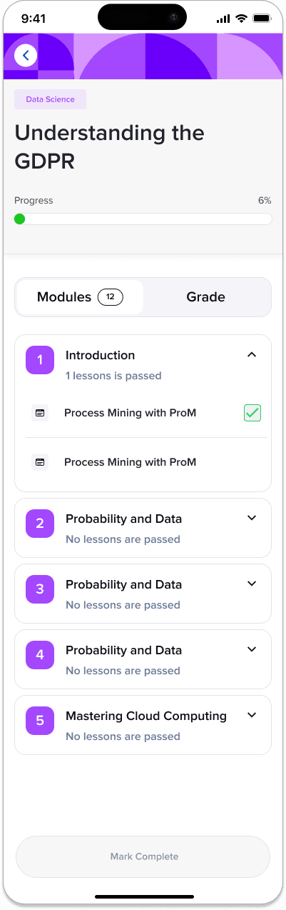
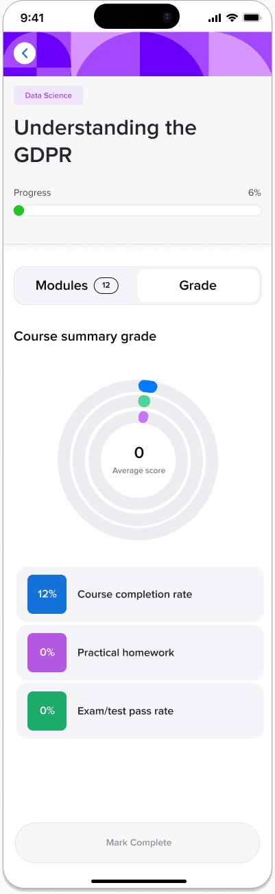
The screens below are from one of the final iterations, which was handed over for implementation and helped to achieve the set goals.


200% increase in development speed, 50% reduction in time to market, 75% decrease in integration time.
Case study